Fountain Pen Nib Sizes Explained: From Extra Fine to Broad
A pen that skips halfway through a shopping list is rarely short of ink. More often the culprit is the nib — the metal point at the end of the pen — and the size of it. Extra fine, fine, medium, broad: those letters look tidy and comparable. They are not. A Japanese fine and a German fine can sit a full size apart. Here is what the letters mean in practice, and how to choose a nib you will still enjoy using next year.
What the letters actually tell you
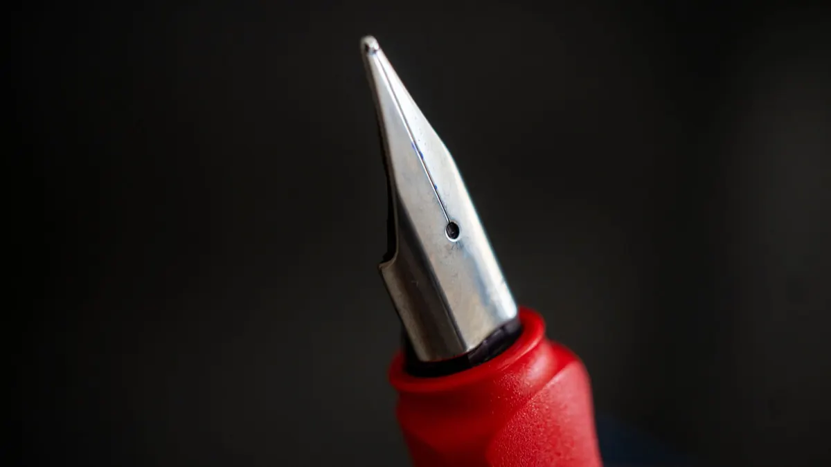
A nib size describes the width of the tipping material — the small bead of hard metal welded to the end of the point, where ink meets paper. An extra fine has a narrow tip; a broad has a generous one. Everything else about the nib, from the shape of its shoulders to the metal it is made from, is a separate question.
The letters are nominal. No international standard forces a medium to measure a set width, so "fine" is a category rather than a figure. Expect variation between brands, and occasionally between two nibs from the same factory.
Line width is a partnership of three things:
- The nib's tipping size. This sets the basic range, but it is only the beginning.
- The ink's flow. A wet ink spreads more generously than a dry one, even from the same nib.
- The paper's absorbency. Copy paper drinks ink and feathers the line; coated paper holds it tight and crisp.
Change any one of those and the line changes with it. A medium nib that looks restrained on a smooth notebook can look almost broad on a cheap envelope. That is why the letter on the feed is a starting point, not a promise.
The standard sizes, from needle to brush
Extra Fine (EF)
Extra fine is the narrowest common size. It lays down a thin, precise line that suits marginal notes, tiny handwriting, complex diagrams, and cheap paper that would otherwise bleed. It can feel slightly scratchy if the tines are misaligned or if you rotate the pen, because there is less tipping material to glide on. On good paper, a well-tuned EF can still feel smooth, but it will never be buttery in the way a broad nib can.
Fine (F)
Fine is the everyday compromise for many writers. It is narrow enough for forms, crosswords, and pocket notebooks, yet broad enough to show ink colour and shading. If you write small but want a little personality, fine is often the safest first choice. It also tends to behave well on office paper, where a broader nib might feather or show through.
Medium (M)
Medium is the middle of the road, and for many brands it is the default. It offers a comfortable balance: enough line width to reveal shading and sheen, enough control for ordinary handwriting. Medium suits journaling, letter writing, and general note-taking. It is also the size most likely to feel "just right" to a fountain pen beginner, because it is forgiving of paper and pressure without being a paintbrush.
Broad (B)
Broad nibs lay down a confident, wet line. They are wonderful for signatures, headings, thank-you notes, and showing off inks with complex colours. They can make even hurried handwriting look deliberate. The trade-off is practical: broad nibs use more ink, dry more slowly, and can bleed through thin paper. They also demand a little more space between lines, or your letters will run together.
Beyond broad, you enter the world of double broad, triple broad, and custom grinds. These are specialist tools, often beautiful and often thirsty. They are not the nib you want for a pocket-sized planner, but they can be a joy for correspondence.
Why a Japanese fine is not a German fine
One of the most common surprises in fountain pens is regional variation. Japanese nibs — from Pilot, Platinum, and Sailor — generally run finer than their Western equivalents. A Japanese medium often feels like a Western fine. A Japanese fine can feel like a Western extra fine. German and other European nibs — Pelikan, Montblanc, Lamy, Kaweco — often run wider and wetter by comparison.
This is not a flaw. It reflects different writing traditions and different expectations about ink flow. But it means you cannot simply order the same letter from every brand and expect the same result. If you love a Japanese fine, a German fine may feel too broad. If you love a German medium, a Japanese medium may feel too narrow.
A nib size is a starting point, not a promise. The paper and ink finish the sentence.
It is not just width: stub, italic, flex, and architect
Width is only one way a nib can differ. The shape of the tipping material changes the character of the line:
- Stub: A broad, flat tip that gives thick vertical strokes and thinner horizontal ones. It adds elegant line variation without demanding much skill.
- Cursive italic: A sharper version of a stub. It produces crisper variation but can catch on paper if you rotate your hand.
- Flex: A nib designed to spread under pressure, creating dramatic thick-to-thin transitions. Vintage flex is prized, but modern flex nibs vary widely in how much pressure they need.
- Architect: The opposite of a stub, with a narrow vertical stroke and a wider horizontal one. It gives handwriting a distinctive, almost calligraphic texture.
These grinds are not replacements for standard sizes. They are additional choices. If you already know you like a medium line but want more expression, a medium stub can be a revelation.
How ink and paper change everything
Two writers can use the same pen and nib and get different results. That is not imagination; it is chemistry and fibre.
- Dry inks tend to make a nib feel narrower and more controlled. They suit extra fines and cheap paper.
- Wet inks make a nib feel broader, smoother, and more generous. They can turn a fine into a medium on absorbent paper.
- Absorbent paper pulls ink outward, feathering the line and making it look wider. It also increases bleed-through.
- Smooth coated paper holds ink on the surface, preserving crisp edges and showing shading, sheen, and shimmer more clearly.
Writing pressure matters too. Pressing hard can splay the tines and widen the line, especially on softer nibs. A light hand gets the most consistent result and is kinder to the nib over years of use.
Matching the nib to the job
If you are unsure where to begin, start with the task rather than the letter:
- Daily notes and margins: extra fine or fine. They keep your handwriting legible in small spaces.
- Journaling and letters: fine or medium. They balance personality with practicality.
- Signatures and headings: broad, stub, or italic. They make a statement.
- Cheap office paper: fine or extra fine. They reduce bleeding and show-through.
- Sheen and shimmer inks: medium or broad. They lay down enough ink for the effects to appear.
- Long writing sessions: medium or fine in a comfortable pen. The nib matters, but so does the grip and weight.
If you write on many different papers, a fine or medium nib is the most versatile. If you write on one paper you know well, you can afford to choose a nib that flatters it.
Testing before you commit
Nib sizes are personal, and the only reliable test is your own hand. Before buying an expensive pen, try these steps:
- Visit a pen show or shop and write with several sizes on the paper you actually use.
- Buy an inexpensive pen from the same brand to test its sizing. A Pilot Kakuno and a Pilot Custom 74 will not feel identical, but their fine nibs will be in the same family.
- Choose a pen with interchangeable nib units, so you can swap sizes later without buying a whole new pen.
- Keep a small notebook of nib, ink, and paper combinations. After a few months, your preferences will be obvious.
Do not assume your first choice is your forever choice. Tastes change. Handwriting changes. The paper you use changes. A nib that felt too fine last year may feel perfect now that you write smaller.
Common myths and practical truths
- Myth: A finer nib always uses less ink. It usually does, but a dry fine and a wet broad can differ enormously. Flow matters as much as width.
- Myth: Broad nibs are only for signatures. They can be excellent for journaling if you write large, use good paper, and enjoy seeing ink at its most expressive.
- Myth: You must choose one size forever. Most fountain pen users end up with a small range: an extra fine for forms, a medium for letters, a stub for headings.
- Truth: Comfort beats specification. The best nib is the one that makes you want to write, not the one that matches a chart.
The short version
Extra fine, fine, medium, and broad are useful labels, but they are not measurements. Japanese nibs tend to run finer than Western ones. Ink and paper can shift the line by a full size. Grinds like stub, italic, flex, and architect add character beyond width. If you are new to fountain pens, start with a fine or medium from a brand you can test, use paper you like, and give yourself room to change your mind.
Choose the nib that suits your hand, your paper, and your pleasure — then let the letters take care of themselves.